Using Data & Analytics to Track Change Adoption
 ACTSol and Associates
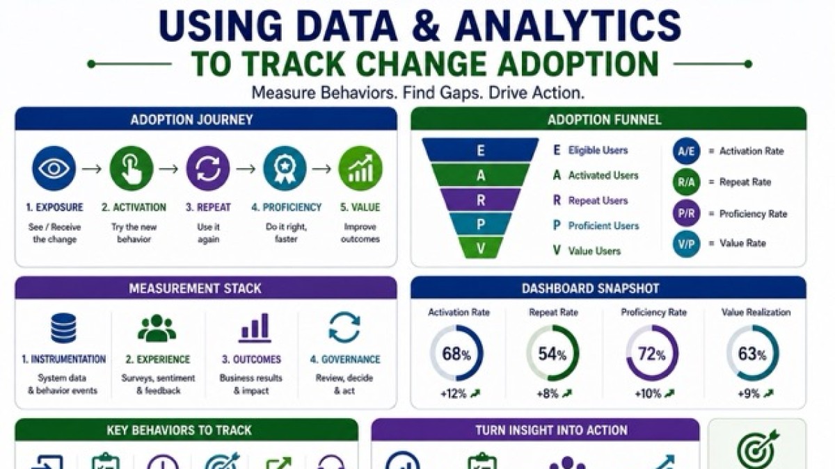
Track change adoption with data—not launch noise—so you can diagnose and act.

Most change programs fail in a very predictable way.
Leaders “announce” the change. Training is “delivered.” Comms are “sent.” Then everyone waits for adoption to magically happen. It doesn’t.
Adoption is not a speech. It is a set of observable behaviours repeated under real work pressure. If you can’t see those behaviours in data, you can’t manage them. You’re just hoping.
The good news: you can instrument change the way product teams instrument an app launch using dashboards, usage analytics, sentiment signals, and closed feedback loops. Done right, data doesn’t just report adoption. It tells you where it’s working, where it’s bleeding, and what to fix next.
This article shows you how.
Adoption is not one metric. It’s a chain.
A common mistake is tracking adoption with a single number: “% trained” or “% logged in.”
That’s not adoption. That’s activity. Real adoption is a chain that looks like this:
- Exposure: Did people see / receive the change (comms, access, enablement)?
- Activation: Did they attempt the new behaviour at least once?
- Repeat usage: Did they do it again without being chased?
- Proficiency: Did they do it correctly, faster, with fewer errors?
- Value: Did the change improve outcomes (cycle time, quality, cost, risk)?
If your metrics don’t reflect this chain, your dashboard becomes a comfort blanket.
A practical model: the Change Adoption Measurement Stack
Think of change measurement as a stack with four layers. If you only build the top layer (dashboards), you’ll be staring at empty charts.
- Layer 1: Instrumentation (behaviour data). System logs, process timestamps, feature events, workflow steps, transaction records.
- Layer 2: Experience (human signals). Pulse surveys, sentiment, qualitative feedback, manager observations, champion inputs.
- Layer 3: Outcomes (business results). Speed, quality, cost, compliance, customer impact, safety, revenue.
- Layer 4: Governance (decision loop). Who reviews the data, how often, what decisions are made, and how actions are tracked.
This is how you move from “measurement theatre” to operational control.
Step 1: Define adoption as critical behaviours, not slogans
Start with one question: What must a person do differently on Monday morning for this change to be real?
Write those as “critical behaviours.” Keep them specific and measurable.
Example: CRM rollout (B2B sales)
Not “use the CRM.” Instead:
- Log every qualified lead within 24 hours
- Update opportunity stage weekly
- Attach meeting notes for key accounts
- Generate quote from CRM (not Excel)
- Use standard reason codes for lost deals
Now you can instrument those behaviours.
Why this matters: Training tells people what to do. Behaviour metrics show you whether they did it, repeated it, and did it correctly.
Step 2: Build an adoption journey and mark the “drop-off cliffs”
Most changes have a predictable journey: Access → First attempt → First success → Repeat usage → Mastery → Habit
Adoption usually breaks at a few cliffs:
- People can’t access the system (roles, permissions, devices)
- The first attempt fails (errors, confusing UI, missing data)
- The process is slower than the old way (perceived productivity loss)
- Managers still accept old outputs (parallel processes stay alive)
Your analytics should be designed to detect these cliffs early.
A simple adoption funnel you can use. For any system / process change, track:
- Eligible users (E): Who should adopt?
- Activated users (A): Who attempted at least once?
- Repeat users (R): Who repeated within a defined period?
- Proficient users (P): Who meets quality rules (low errors/rework)?
- Value users (V): Who contributes to the intended outcome shift?
Then monitor conversion rates:
- A / E = activation rate
- R / A = repeat rate •P / R = proficiency rate
- V / P = value realization rate
A dashboard that shows these ratios by role, location, and manager will embarrass “green status” reporting very quickly.
Step 3: Instrument the change like a product team would
Instrumentation is not spying. It is operational visibility. You instrument events that represent adoption behaviours.
What to instrument (practical categories)
- Login / access events: who can get in, how often
- Feature / workflow events: create, submit, approve, close, escalate
- Time stamps: start time, completion time, waiting time
- Quality markers: error rates, rework loops, rejection reasons
- Workarounds: exports to Excel, email approvals, manual overrides
- Support signals: tickets by category, repeat issues, time-to-resolve
Example: Procure-to-pay change in an ERP
Instrument:
- PR created → PR submitted → PR approved → PO created → GRN posted → invoice matched → payment released Track where work piles up and where it gets rejected. What you’ll see quickly:
- A specific approval step is the choke point
- A plant / site has higher rejection due to missing master data
- One manager is still demanding email approvals (parallel process)
Data turns “opinions” into a map.
Step 4: Build dashboards that drive action, not PowerPoint
A change dashboard should answer three questions:
- Where are we bleeding adoption? (drop-offs)
- Where is adoption strong? (hotspots you can copy)
- What action is required next week? (targeted interventions)
The dashboard sections that actually work
A) Adoption Funnel (by role / site / manager)
Eligible → Activated → Repeat → Proficient → Value
B) Hotspot Heatmap. A simple matrix:
- Rows = sites / teams
- Columns = critical behaviours
- Cell = adoption score (0–100) This shows you exactly where to deploy champions and coaching.
C) Drop-off Diagnostics. Top 5 drop-off points with likely causes:
- Access issues
- Training gap
- Process design friction
- Data / master setup gap
- Manager reinforcement gap
D) Sentiment + Feedback. Not just “happy score.” Track:
- Confidence (“I can do my job in the new way”)
- Clarity (“I know what good looks like”)
- Support (“I know where to get help fast”)
E) Intervention Tracker. What you did, where you did it, and whether it moved the metric.
Dashboards without intervention tracking become decorative.
Step 5: Use usage analytics to find adoption hotspots and drop-offs
Usage analytics is where the truth lives. It shows behaviour at scale.
What “hotspots” look like in data
A hotspot is a team that:
- Has high repeat usage
- Has low errors / rework
- Hits the new process cycle time
- Shows neutral-to-positive sentiment Hotspots are gold. Not for praise. For replication.
Example: HR self-service portal adoption
- Location A: 78% employees use portal for leave requests; low helpdesk tickets
- Location B: 22% use portal; high tickets; managers still ask for WhatsApp requests
Your response is not “send another email.” Your response is:
- Identify the manager behaviour differences
- Copy the enforcement and coaching practices from A to B
- Remove acceptance of old channels in B
What “drop-offs” look like. Drop-offs show up as:
- High activation but low repeat (people tried once, hated it)
- High repeat but low proficiency (habit without correctness)
- High proficiency but no value shift (wrong metric, wrong process design, or the change isn’t connected to outcomes)
Example: Customer service knowledge base
- Agents search often (repeat usage high)
- But call handling time doesn’t drop (no value). Why?
- Articles are outdated
- Search results irrelevant
- Agents can’t find the “answer snippet” fast enough. This is not a training issue. It’s content governance and UX.
Data prevents you from misdiagnosing.
Step 6: Add sentiment analytics so you don’t confuse silence with buy-in
Usage tells you what is happening. Sentiment tells you why. But sentiment must be designed properly. “Are you happy?” is useless.
Better sentiment questions (that predict adoption)
Track these three weekly / fortnightly during rollout:
- Clarity: “I understand what is changing in my work.”
- Confidence: “I feel able to perform the new process.”
- Commitment: “My manager expects and supports the new way.”
Add a free-text field: “What’s the biggest friction point this week?”
Now you can code feedback into themes:
- Access /data issues
- Process steps unclear
- System slow / unstable
- Approval delays
- Policy confusion
- Training gaps
Example: Field technicians adopting a mobile app. Usage shows low completion of job closure in the app.
Sentiment reveals: network drops in specific geographies + app crashes on older devices.. Your solution becomes device / network support and offline mode; not more training.
Step 7: Build feedback loops that close, not just collect
Feedback without closure is worse than no feedback. It teaches people that speaking up is pointless. A practical loop looks like this:
- Collect: surveys, champions, tickets, in-tool prompts
- Triage: classify + urgency + ownership
- Fix: process, training, system, policy, data
- Communicate: “You said → We did”
- Verify: did the metric move?
The “48–72 hour” rule for early change
In the first 4–6 weeks of rollout:
- Triage feedback within 48 hours
- Communicate an action / decision within 72 hours
Not every issue can be solved fast. But every issue must be acknowledged fast. This is how trust is built during disruption.
How data reveals targeted training needs (and stops wasteful training)
Most training plans are broad. They assume everyone needs the same help. Analytics allows precision training; who needs what, when, and why.
A simple method to identify training needs from data. For each critical behaviour, segment users into 4 groups:
- Never started: no activation
Need: access help + manager reinforcement + onboarding nudges - Tried and dropped: activation but no repeat
Need: friction removal + guided practice + job aids - Doing but wrong: repeat but high errors/rework
Need: scenario training + quality rules + coaching - Doing well: proficient and consistent
Need: advanced tips + champion pathway + peer teaching
Example: New expense policy + tool
- Group 1: Didn’t submit any claims → likely unaware or blocked
- Group 2: Submitted once, then stopped → tool confusion or “too slow”
- Group 3: Submits often but gets rejected → misunderstanding policy rules
- Group 4: High compliance, low rejections → turn them into peer coaches Now training becomes targeted, not theatrical.
What targeted training looks like in practice
- 10-minute microlearning for “tried and dropped”
- Manager-led huddles for “never started”
- Role-based simulations for “doing but wrong”
- Office hours for specific steps (e.g., approvals, exception handling)
- “Champion clinics” run by hotspots (peer credibility beats HQ slides)
A worked example: Adoption analytics for a new approval workflow
Let’s make this concrete.
Change: Replace email approvals with a workflow tool for purchase requests.
Instrumentation
Track:
- PR created
- PR submitted
- Approval requested
- Approval granted / rejected
- Rework cycle count
- Time in each stage
- “Email approval detected” (manual override / workaround)
- Tickets raised by category
Dashboard insights after 2 weeks
- Activation is high: most teams created PRs in the tool
- Repeat is weak in two sites: they revert to email after first attempt
- Drop-off occurs at “approval requested” stage
- Approval time is 3× slower under Manager X
- Rejection reasons: missing vendor codes + wrong cost centre mapping
What data reveals. This is not a “training completion” problem.
It’s a combined issue:
- Master data readiness (vendor codes)
- Cost centre mapping clarity (policy + job aid)
- Manager reinforcement (Manager X bottleneck)
- Process friction (approval step too slow)
Targeted actions
- Fix vendor master data for two sites within 72 hours
- Provide a one-page cost centre cheat sheet + in-tool prompt
- Coach Manager X with SLA expectations + delegate rules
- Deploy a champion from a hotspot site to run a 30-minute clinic
- Monitor the next week’s funnel conversion + approval time
That is what data-driven change looks like: diagnose → act → verify.
The metrics that matter (and the ones that lie)
Strong metrics (actionable)
- Time-to-first-success (first complete transaction correctly)
- Repeat usage within a defined cycle (weekly / monthly)
- Error / rework rates
- Process cycle time breakdown (where time is spent)
- Workaround frequency (Excel exports, emails, manual overrides)
- Support demand trends (tickets by category)
- Confidence / clarity / manager support sentiment
Weak metrics (often vanity)
- “% Trained” (attendance is not capability)
- Total logins (can be forced; doesn’t equal adoption)
- Town hall attendance •Number of emails sent
- Number of champions nominated (without activity proof)
If a metric doesn’t tell you what to do next, it’s not a management metric.
Don’t break trust: ethics, privacy, and “surveillance fear”
If people feel watched, they will game the system, not adopt the change.
Use these guardrails:
- Track process events, not personal drama
- Use role-based aggregation where possible (team-level first)
- Be transparent: “Here’s what we track and why”
- Separate performance management from early adoption measurement
- Use data to remove friction, not to punish experimentation
A measurement system that feels unfair will create resistance even if the change is good.
A 30-day blueprint to instrument adoption fast
Week 1: Define and design
- List critical behaviours (5–10 max)
- Map adoption journey and drop-off cliffs
- Define funnel stages + success criteria
Week 2: Instrumentation setup
- Identify data sources (system logs, workflow steps, ticketing, surveys)
- Create event definitions + naming standards
- Build a minimum viable dashboard (funnel + heatmap + tickets)
Week 3: Feedback loop and governance
- Set review cadence (weekly adoption huddle)
- Assign owners for each metric area (system, process, training, comms)
- Launch pulse surveys + free-text coding
Week 4: Targeted interventions
- Identify hotspots and drop-offs
- Deploy targeted training + friction fixes
- Publish “You said → We did”
- Verify metric movement and refine
This approach gets you traction while the change is still alive not three months later when people have already built workarounds.
The bottom line.
Change adoption becomes manageable when you stop treating it as an emotional mystery and start treating it as a measurable system.
Dashboards tell you where. Usage analytics tells you what. Sentiment tells you why. Feedback loops tell you what to fix next. And the real win is this: data doesn’t just track adoption. It creates a culture where adoption is supported, coached, corrected, and sustained; not demanded and hoped for.
If you want, I can also create a ready-to-use Change Adoption Dashboard template (metrics, definitions, funnel stages, heatmap structure, and review meeting agenda) that you can plug into any program.
Categories: : Management